Plot
License
Download
http://utopia.duth.gr/~glykos/progs/plot.tar.gz
The tar file includes source code, documentation, and executables for GNU/Linux & MacOSX (both i686 and ppc).
Where are the screenshots ?
Skip down this document to the sections entitled Examples.
What is 'plot' ?
plot is a small, simple and straightforward plotting program for GNU/Linux and MacOSX. plot may be useful to people that love working from within the unix shell, hate herding the mouse around, and need a plotting program that can read standard input and can be used in unix pipelines
tac mydata.dat | awk '{print $17,$21,$23}' | plot
plot can do simple x-y plots, can overlay two x-y plots, can draw histograms, can do scatter plots, and can draw contour plots of your matrices (using bicubic interpolation). It can even do pseudo-color representations of your matrices with (or without) overlaid contours.
Yet another plotting program ? Why ?
Because I had enough. After two hours of Google-ing, it appeared faster to write it, than to find it: I was looking for a really simple and straightforward x-y plotting program that you could just tell it (from the command line) “plot thisfile” (or even better “plot < thisfile”) and would just go ahead and produce a nice and simple x-y plot (xmgr is my favorite, but it is getting harder and harder to move it to new machines). All programs I found needed half a dozen libraries to get them started, and most of them needed quite a lot of mouse herding around the desktop. So, I gave-up and wrote it. On its way to the present time, plot acquired the ability to draw histograms, contours & pseudo-color representations of matrices, etc., but these were not part of the original plan … ![]()
Dependencies
plot is using Ygl, but you don't have to download anything: By compiling it statically against Ygl, the executables that I distribute only depend on X11 libraries and nothing else. If you can find a 32bit X11-capable GNU/Linux machine that the plot executable does not work out-of-the-box, I would love to hear from you ('famous last words' I hear you say, but I have seen this executable working on anything from RedHat 7.3, to Scientific Linux 5.2, to debian etch, to CaOS NSA 1.0, to Ubuntu 11.04).
Prelude
plot was indented to be simple, primitive and straightforward, so here are the assumptions:
- Does not have any command-line arguments (well, almost, see flags below), and does not open files. All it wants is standard input.
- If the number of columns found in standard input is one,
plotwill make an x-y plot with that column. - If the number of columns found in standard input is three,
plotwill assume that you want to overlay two x-y plots: the (x) values are in the first column, the (y1) values in the second, the (y2) values in the third column. - If the number of columns found in standard input is more than three,
plotwill make a simple x-y plot of the first two columns. - Now the difficult part:
- if the number of columns is two, and the values of the first column increase monotonically, then you will get a nice and simple x-y plot,
- but, if the number of columns is two, and the values of the first column do not increase monotonically,
plotwill assume that what you want is a scatter plot of the variables contained in these two columns. If that's the case,plotwill fix the reference frame to be a square.
- Contour plots : If you have a matrix, you can make a contour diagram (or a pseudo-color representation) of it using 'plot' with the '-c' (or '-cc') command-line flags. The nice thing is that 'plot' will use bicubic interpolation for small matrices, giving nice-smooth plots with even tiny matrices. See the 'examples' section below for details.
Careful : The 'number of columns' is decided from the first line. If no numbers can be found on the first line, 'plot' will assume that it is a header line and will discard it.
Command-line flags and Key bindings
| COMMAND-LINE FLAGS | |
|---|---|
| 'plot -h' | Make a histogram of the input data if possible. All binning choices are windoze-like [ie. they are automatic, you have no control (other than re-compiling the program), they are a take-it-or-leave-it thing]. Use 'plot -hs' to save the values used for the histogram in a file named 'plot.histogram' |
| 'plot -c' | Assume that the input data constitute a matrix, and make a contour plot of the matrix. If you want to see negative (dotted) contours press the key 'n'. |
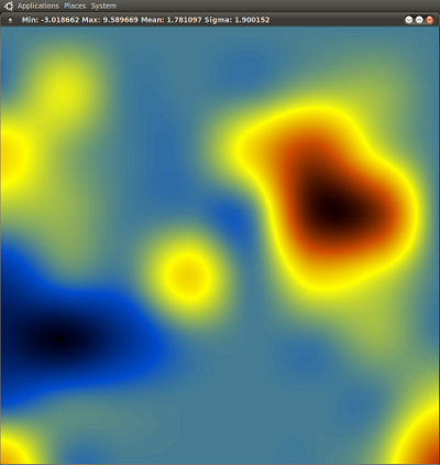
| 'plot -cc' | Like '-c' but instead of contours, make a pseudo-color representation of the matrix. If you want to see contours superimposed on it, press the key 'c'. |
| 'plot -cv' | Same as '-c', but 'plot' is more talkative, and writes-outs two files containing the bicubic interpolation of the data. See 'examples' below for intended usage. |
| 'plot -l' | Take the natural logarithm of the y values. Use '-ll' to make log-log plots. |
| 'plot -k[ccc]' | This is a mystical feature allowing column selection. If you can't be bothered with awk, have a look at the section entitled I hate awk. |
| KEY BINDINGS | |
| Quitting : | With the cursor in the graphics window, press the 'q' key. |
| Using dots instead of lines | To use dots instead of lines in x-y plots, press the 'd' key. If you want filled circles, press the 'f' key. If you want both lines and filled circles, press first the 'f' key and then the 'd' key. |
| Getting the coordinates | Any time you left-click the mouse on the graphics window, you will get the corresponding point's coordinates printed on the terminal. For contour plots you will get fractional (matrix) coordinates running from 0.0 to 1.0. |
| Draw primitive labels | Press the 'l' key. |
| Zooming-in (x-y mode) | Click the right mouse button once to define the upper-left-hand corner of the area of interest. Then click again the right mouse button to define the lower-right-hand corner. If you want to go back to the original zoom, click twice without moving the mouse. |
| Zooming-in (contours) | In the contour-plotting mode you can zoom-in (only once) by placing the cursor on the point of interest and pressing the 'z' key. Press 'z' again to go back to original zoom. This operation may take some time because the program re-interpolates the matrix. |
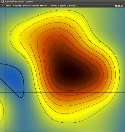
| Plotting negative contours | In the contour-plotting mode, press the 'n' key to draw a thick line at mean density and negative (dotted) contours. Please note that these 'negative contours' refer to contours drawn below the mean [at mean - n*(σ/2)] and they may as well correspond to positive matrix values. |
| Pseudo-color + contours | Start the program with 'plot -cc', place the cursor in the graphics window, and press the 'c' key. Having drawn the contours, the 'n' key (for negative contours) also works. |
| Changing contouring levels | Use the '+' and '-' keys to increase and decrease the number of contours displayed. This works by doubling or halving the previous contouring step [if it was (σ/2) it will become (σ) or (σ/4)]. |
| Screenshot | Press the 'p' key. A PPM file with the name plot.ppm will be created in the current working directory. |
Examples : Simple x-y plots and histograms
For these examples, the input file looks like this is :
# more carma.fluctuations.dat
       1   14.3320999  -20.4194094    4.1332284   -2.1288246   -7.1497684    8.5762608    0.4169523    2.4870337    1.2441678    3.8924299
       2   14.1285962  -20.7883457    4.2183205   -2.3730596   -7.1385388    8.4892111    1.1572022    2.9927501    1.0526865    3.7364406
       3   14.4217257  -20.8996364    4.3084930   -2.2384111   -6.9569825    8.1143581    1.0611191    2.9113616    1.2277020    3.6306058
       4   13.3975232  -20.8700142    3.8173974   -2.3456013   -6.6871156    7.2537643    0.1502628    2.5164794    0.6227093    4.5228650
       5   13.1985022  -20.5415719    3.9114422   -2.3587723   -6.9297208    6.9310010    0.1999070    3.2278148   -0.6974885    5.3552127
       6   13.1615580  -20.0065238    4.4518842   -2.3491788   -6.6043982    6.8842854    0.0163845    3.9936512   -1.1514745    5.5311086
       7   13.2316726  -19.9872505    4.2961086   -2.4122156   -5.4775955    6.3390008   -0.2047456    4.6334193   -1.3132818    5.2039226
       8   13.1228243  -19.8005374    3.8029002   -2.7385544   -4.8316507    5.5700170    0.0167480    5.1761963   -1.1013039    4.6200819
       9   12.7412454  -19.1183392    3.2886442   -2.4502471   -4.9822194    5.0888352   -0.8199207    4.4836414   -1.1261848    3.9395432
      10   12.1185438  -18.7219854    2.9502052   -2.5690032   -5.6837771    5.1838664   -1.4527906    5.0144346   -0.9814302    4.1303176
      11   12.3482936  -18.0708445    3.4113838   -2.6094426   -6.5299071    5.8330196   -1.4151283    4.7366589   -2.1826474    4.2988519
      12   13.1891001  -17.5881266    3.9598192   -2.8533764   -6.3252438    6.1465430   -0.5894506    4.5579859   -2.1569819    5.2405578
      .......................
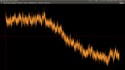
Let's start. Plot the first two columns in the file :
# plot < carma.fluctuations.dat
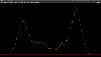
Make a histogram of the y values (second column) :
# plot -h < carma.fluctuations.dat
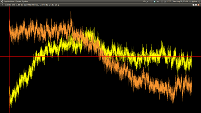
Overlay two x-y plots : columns 1-2 vs columns 1-3 :
# awk '{print $1 " " $2 " " $3}' carma.fluctuations.dat | plot
Note that if your file only contained three columns, you wouldn't have needed the awk command shown above. A simple plot < myfile would have been sufficient. See also the I hate awk section below for a trick allowing you to select columns directly from the command line.
Examples : Scatter plots
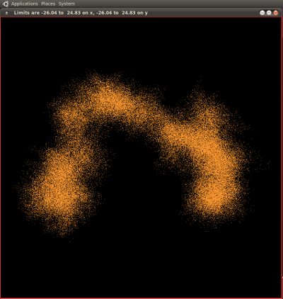
Scatter plot of two columns. The program hypothesizes that you want a scatter plot because the numbers in the first column are not monotonically increasing [if they were increasing, 'plot' would have prepared a simple (line) x-y plot].
# awk '{print $2 " " $4}' carma.fluctuations.dat | plot
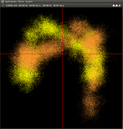
Overlay two scatter plots (you'll have to press the 'd' key) :
# awk '{print $2 " " $3 " " $4}' carma.fluctuations.dat | plot
Examples : Contour plots
This is fun :
# cat matrix.dat
 1  1  1  1  1  1  1  1
 1  3  1  1  1  2  2  1
 4  2  1  1  4  7  3  1
 2  2  1  1  1  9  8  1
-1  1  1  4  1  4  3  1
-2 -3 -1  1  1  1  2  1
 0  1  1  1  1  1  1  3
 5  1  1  1  1  1  2  7
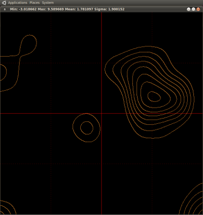
Draw a contour plot with the first contour at (mean + σ/2), and then every (σ/2) :
# plot -c < matrix.dat
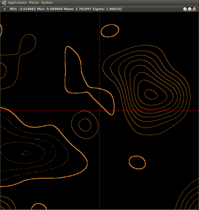
Press the 'n' key. Bold contour at mean, and then every +σ/2 (solid lines), and -σ/2 (dotted lines).
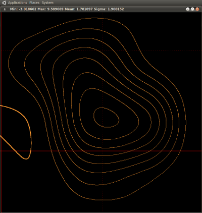
Place the cursor on the highest peak, and press the 'z' key :
Examples : Pseudo-color plots
Using the same data as above:
# plot -cc < matrix.dat
Press the 'c' key. First contour at mean+σ/2, and then every +σ/2.
Press the 'n' key. Bold contour at mean, and then every +σ/2 (solid lines), and -σ/2 (dotted lines).
Place the cursor on the highest peak, and press the 'z' key :
Bicubic interpolation : give me the matrix
So, you decided that it would be great if you could get a copy of the interpolated matrix that 'plot' produces internally (before drawing it). Easier done than said:
# plot -cv < matrix.dat
This will create two files in the current working directory (if write access allows). The files are named bicubic.dat and bicubic_padded.dat. These are the interpolated matrices (dimensions as written-out by the program), their difference being that the bicubic_padded.dat matrix is padded to make it square.
Bicubic interpolation : validation
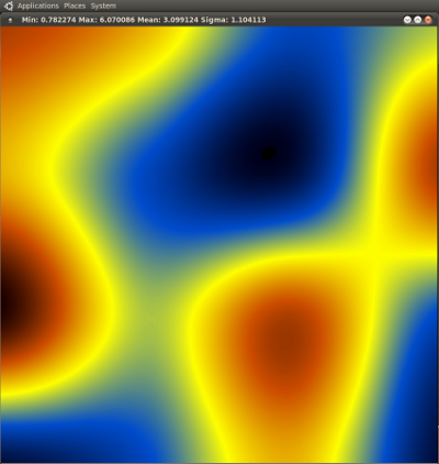
For those persistent meticulous skeptics (ie. scientists) that rightly doubt everything and anything: The interpolation code has not been validated thoroughly. The only check that I have done is to qualitatively compare the MATLAB example shown here with the results obtained from plot :
# cat mat.dat
5 4 2 3
4 2 1 5
6 3 5 2
1 2 4 1
#
# plot -cc < mat.dat
giving :
I hate awk
Pity. Having said that, there are two mystical flags (-k[ccc] and -hk[cc]) that can save you from using awk. Better do this through an example. Assume as before that your data file looks like this :
# more test.dat
       1   14.3320999  -20.4194094    4.1332284   -2.1288246   -7.1497684    8.5762608    0.4169523    2.4870337    1.2441678    3.8924299
       2   14.1285962  -20.7883457    4.2183205   -2.3730596   -7.1385388    8.4892111    1.1572022    2.9927501    1.0526865    3.7364406
       3   14.4217257  -20.8996364    4.3084930   -2.2384111   -6.9569825    8.1143581    1.0611191    2.9113616    1.2277020    3.6306058
       4   13.3975232  -20.8700142    3.8173974   -2.3456013   -6.6871156    7.2537643    0.1502628    2.5164794    0.6227093    4.5228650
       5   13.1985022  -20.5415719    3.9114422   -2.3587723   -6.9297208    6.9310010    0.1999070    3.2278148   -0.6974885    5.3552127
       6   13.1615580  -20.0065238    4.4518842   -2.3491788   -6.6043982    6.8842854    0.0163845    3.9936512   -1.1514745    5.5311086
       7   13.2316726  -19.9872505    4.2961086   -2.4122156   -5.4775955    6.3390008   -0.2047456    4.6334193   -1.3132818    5.2039226
       8   13.1228243  -19.8005374    3.8029002   -2.7385544   -4.8316507    5.5700170    0.0167480    5.1761963   -1.1013039    4.6200819
       9   12.7412454  -19.1183392    3.2886442   -2.4502471   -4.9822194    5.0888352   -0.8199207    4.4836414   -1.1261848    3.9395432
      10   12.1185438  -18.7219854    2.9502052   -2.5690032   -5.6837771    5.1838664   -1.4527906    5.0144346   -0.9814302    4.1303176
      11   12.3482936  -18.0708445    3.4113838   -2.6094426   -6.5299071    5.8330196   -1.4151283    4.7366589   -2.1826474    4.2988519
      12   13.1891001  -17.5881266    3.9598192   -2.8533764   -6.3252438    6.1465430   -0.5894506    4.5579859   -2.1569819    5.2405578
      .......................
Then :
| Command line | What plot will do … |
|---|---|
plot -k5 < test.dat | Make a simple x-y plot of the 5th column |
plot -ka < test.dat | Make a simple x-y plot of the 10th column |
plot -kc < test.dat | Make a simple x-y plot of the 12th column |
plot -hkb < test.dat | Make a histogram of the values contained in the 11th column |
plot -k15 < test.dat | 'x' will be the 1st column, 'y' will be the 5th column |
plot -ka2 < test.dat | 'x' will be the 10th column, 'y' will be the 2nd column. If the values are not monotonically increasing you will see a scatter plot. |
plot -k4a < test.dat | 'x' will be the 4th column, 'y' will be the 10th column. If the values are not monotonically increasing you will see a scatter plot. |
plot -hk4a < test.dat | Identical with plot -hka < test.dat, ie. make a histogram of the values contained in the 10th column |
plot -k125 < test.dat | Superimpose two x-y graphs. The first uses columns 1-2, the second (colored yellow) used columns 1-5 |
plot -k37a < test.dat | Superimpose two x-y graphs. The first uses columns 3-7, the second (colored yellow) used columns 3-10. |
But I have more than 36 columns : Sorry, you'll have to use awk … .-)
Advanced features : plotting a sub-matrix
You can use plot to draw a portion of the matrix given in standard input. If you want to draw a sub-matrix with dimensions (Dx,Dy) which starts at position (x0,y0) of the full matrix, use something like this: ' plot -ccsDx,Dy,x0,y0 < full.matrix ' (no spaces in the flag). The combinations ' -csDx,Dy,x0,y0 ' and ' -cvsDx,Dy,x0,y0 ' also work as expected. The coordinates of the origin (x0,y0) are one-based.
Missing features
plot is intended for quick on-the-fly examination of simple graphs, and not as a substitute of a fully-blown graphing program. This is the reason why plot doesn't do labeling, legends, tick marks, exporting to postscript, and all the goodies that xmgr can do. This is also the reason why you don't have much control (you don't have any control) on the plot limits, the contouring levels, the binning intervals, etc. Having said that, the few things that it does do, it does them well (and without much mouse herding).
Bugs
None. It must be your hardware. But if you insist, do send a description of the problem (with an example data file if possible) to Nicholas M. Glykos (glykos@mbg.duth.gr).
