Adaptive tempering : (T vs Q) and other diagrams
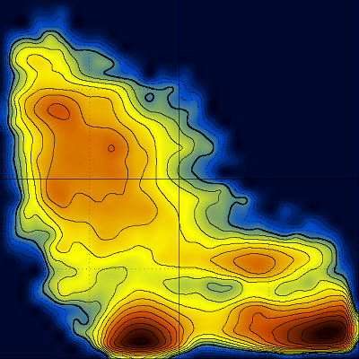
The following are based on a very short (195 ns) folding simulation of the CLN025 decapeptide [ (1), (2) ].
Assuming that your trajectory has a frame that is sufficiently close to the native structure, and that you have one LOG file containing the temperatures, the procedure is technically straightforward :
carma -v -Qfract 8 2 -segid A -ref 42810 my.dcd my.psf
grep '^ENERGY: ' NAMD_LOG | awk '{print $2,$13}' > temps
paste temps carma.Qfraction.dat > T_vs_Q.dat
awk '{print $2,$6}' T_vs_Q.dat | sort -n -k 1 > sortT_vs_Q.dat
awk '{print $6,$2}' T_vs_Q.dat | sort -n -k 1 > sortQ_vs_T.dat
2matrix -30 sortQ_vs_T.dat

plot -cc < grid.matrix
plot -cc < grid_log.matrix
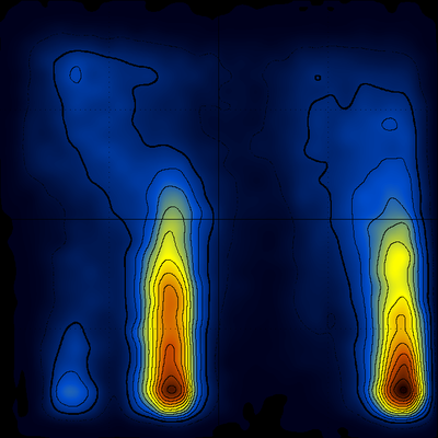
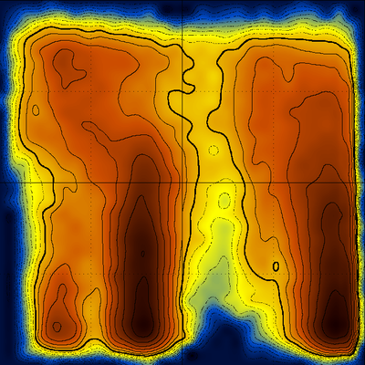
giving after rotation (Q horizontal, T vertical, origin lower-left, the native population lower-right, the other significant population is an offset form of this β-hairpin peptide) :
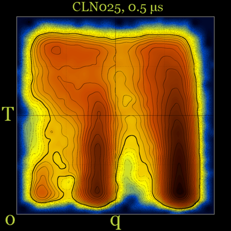
After 0.5 μs of simulation time things don't look that much different [ notice, however, the differences between the populations of the native (q~0.9) and misfolded (q~0.4) structures ] :
Nice. The question is what do we learn from them ?
Examining, for example, the distributions along constant Q values as shown below
would allow the determination of the melting temperature for the native structure, for the misfolded (offset) form, and the comparison between their stabilities (which can easily be inferred from the diagram above). An even more accurate way to do this would be to isolate (using cluster analysis) all frames containing native structures together with their corresponding temperatures and then make a histogram of the respective temperatures.
A multitude of stable but non-native structures (if they were present) would appear as a series of peaks parallel to Q and at low T values (could this be applied to characterizing frustration ????). To separate between different structures with the same Q value, we can use an additional dimension, for example the first principal component. The (log) diagram below has Q horizontal, PC1 vertical and shows that the major populations at the various Q values are probably structurally homogeneous :
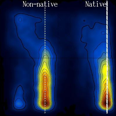
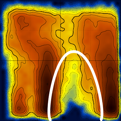
Looking again at the log(T vs Q) diagram, notice the area that is devoid of stable structures (inside the white line) :
Notice also how this low density area extends throughout the temperature range (to high temperatures). Could this be connected with the transition state, and if yes, would it be possible to characterize the transition state structurally ?
Other random notes
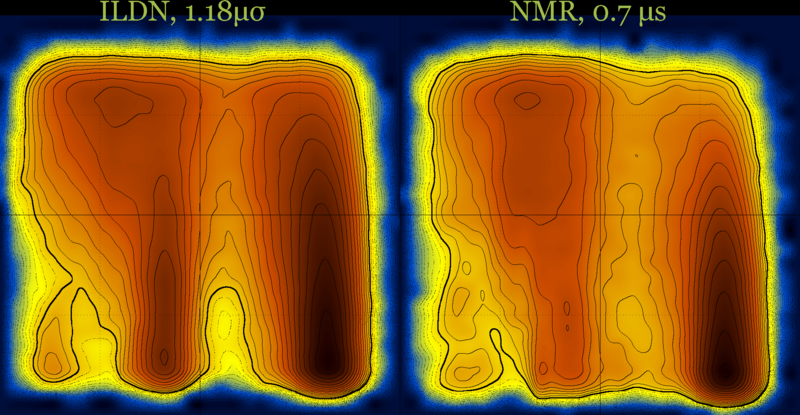
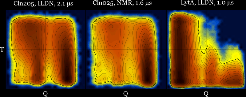
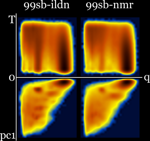
These diagrams may also be useful for force field comparison :
Revisiting the idea of frustration, notice the difference between the behavior of CLN025 (with no significant populations at the (low T - low Q) part of the diagram), compared with the behavior of a different β-hairpin peptide which is a very slow folder (lytA) and its most populated region is the (low T - low Q) part of its diagram.
Can these diagrams successfully differentiate between (a) frustration, and, (b) a high energy transition state as two fundamentally different reasons for slow folding ???
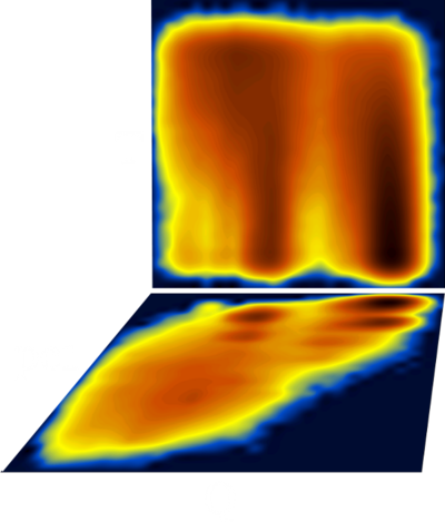
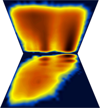
Fancy diagram with Q-T plus Q-PC1 sharing the Q axis (and with perspective for the Q-PC1 diagram). Dihedral PC's were calculated including χ1 angle which explains the splitting along the PC axis.
cln025 : Q-T diagrams for three force fields at 5 μs (same diagrams with and without contours) …
99sb-ildn and 99sb-ildn-nmr : Q-T plus Q-PC1 (sharing q axis) :


